
|
Client Spotlight:
|
|
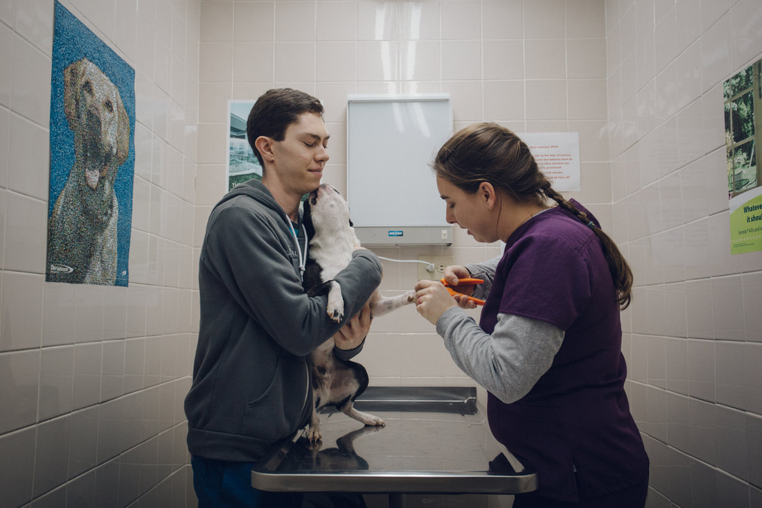
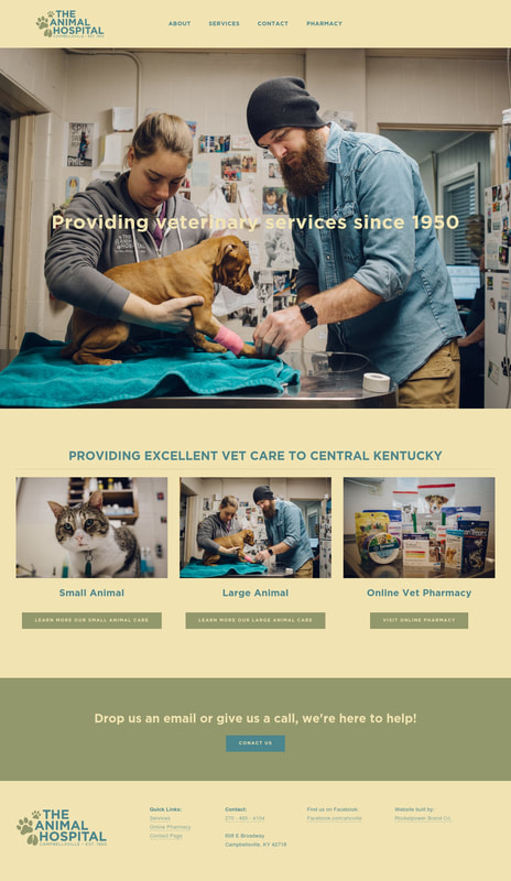
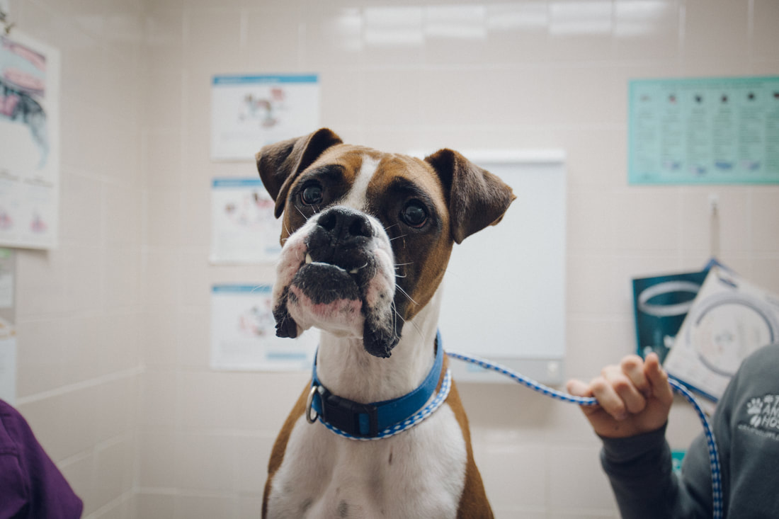
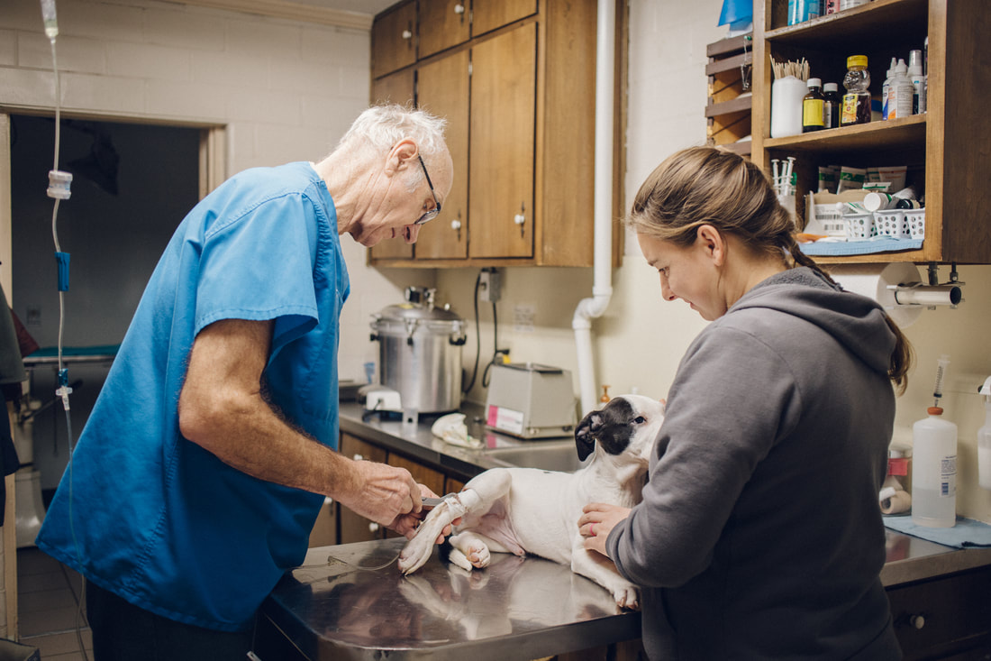
ApproachAnimal house wanted togive life to their old look. We went from very dark earth tones to a lighter, pastel, welcoming environment. We presneted the cream, blue, and olive colorway that seemed to fit and it did. Crafting the logo we wanted something bold, something easy to look good on multiple surfaces. They use this on paper products, scrubs, hats, digital marketing and much more. We also wanted to show action on the website. Not just animal faces. We wanted to show the work they are known for, and how they professioanlly carry out tasks. The team at Animal House love their job, they do it with care in mind and we wanted emotions in both them, and the animals to be shown in the photography.
|
|
|
|
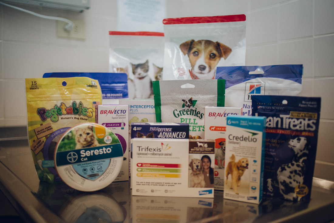
Bringing it homeWe brought it all together to deliver a new image and better function for them. The website is now mobile friendly, and has an online shopping component for a vet pharmacy. The logo and identity is much more reconigizable and has a welcoming feel that matches the personalities inside the clinic. We're proud to work with people who poor their heart into their work. This is one of those projects.
|